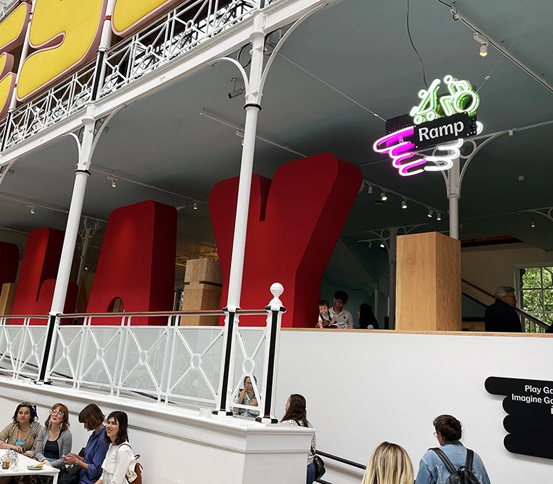
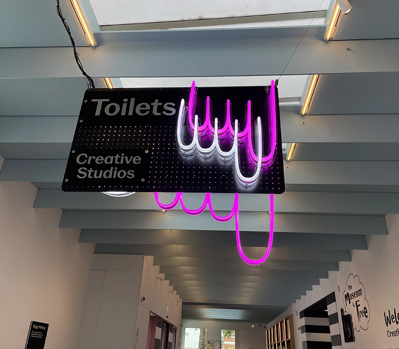
Animated neon wayfinding signage for the Young V&A renovation
As a multi award-winning British signage company, Carousel Lights was appointed to supply a series of illuminated wayfinding signage for the Young V&A museum in London. Following a three-year period of remodelling, led by De Matos Ryan (special planning architect) and AOC (visitor experience), the museum was officially opened by HRH The Princess of Wales, and opened its doors to the public on 1st July 2023.
The 5,200 sq.m museum is a central building to the local community in Bethnal Green, serving as a world-class institution for creativity and inspiration.
Highly regarded for our wayfinding signage expertise, Carousel Lights experience is supplying museum signage and lighting to the heritage sector was crucial in ensuring the needs of the Young V&A client were met. With deep experience working on museum signage at leading heritage sites including The Royal Academy and The Nation Trust, our expertise was sought for the wayfinding signage for this new museum.
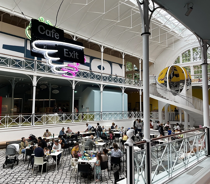
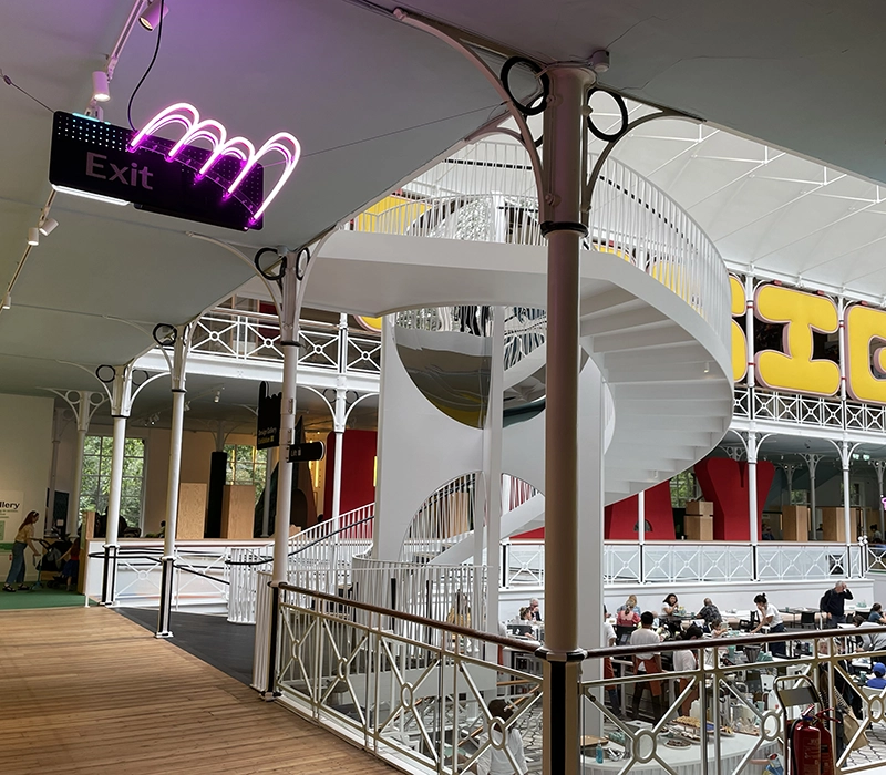
Animated neon signage
Working with the designer’s proposals, Carousel Lights advised on the best technical product to realise their vision. A key factor to their approach was to ensure that lighting solution for the V&A wayfinding signage was an efficient and cost effective solution that was faithful to the original design intent. Carousel Lights’ renowned replica neon product Neon Ultra® was specified as it met all the required criteria. NeonUltra® is an energy efficient LED lighting solution that offers great versatility; standard and RGB colour solutions, DMX animation, Pixel programming as well as being able to replicate many different font and graphic styles at varying stroke widths.
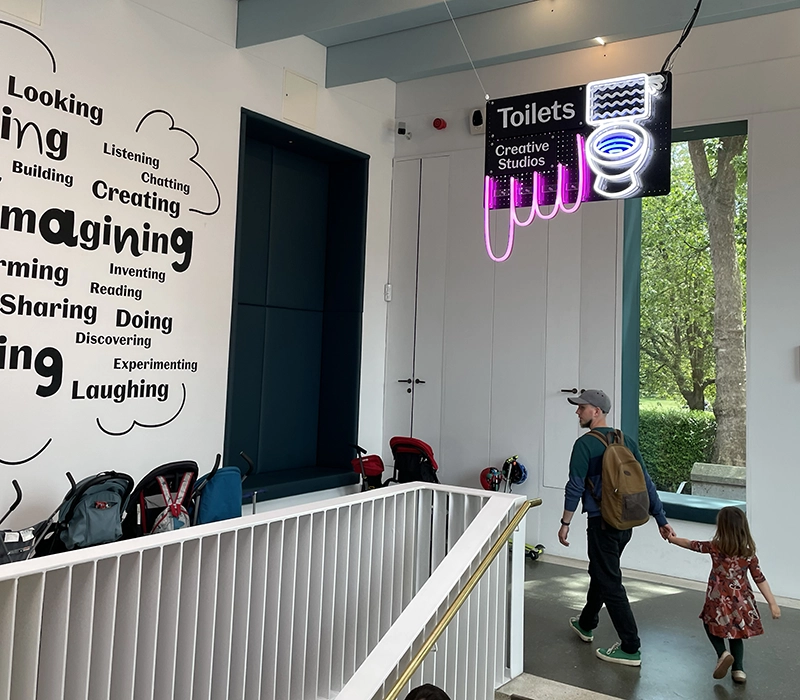
Carousel Lights advised on how to value engineer the Neon Ultra® that was being employed as the museum’s signage to have the result that the client required but to be more cost-effective at the same time. For instance, fewer lines on the toilet and fewer handles for the flush – thus keeping the project within budget but whilst maintaining the design intent and integrity. For the same purpose, standard colours were used where possible and RGB illumination was employed only where needed, such as the special colours for the ramp and lift signage.
The museum signage was designed to appeal to and be easily relatable to by their visitors, the children. One of the signs in particular that has gathered a lot of attention is the toilet sign. This has pre-programmed DMX controllers wired to the Neon Ultra® this was then animated to give the appearance of the toilet handle being pushed down and the cistern filling with water and then emptying again – the animation being on a constant loop. This achieved a very functional wayfinding objective in a fun and playful manner which suited the broader environment of a children’s museum. Animated gifs were sent to the client in advance in order to ensure that everyone was happy with how the animation would play, along with technical proofs for all the signage to make sure that expectations were all aligned.
Real neon versus LED ‘neon’
When working with heritage clients on their museum signage projects, we draw from a full range of product options to decide what’s best suited to each particular client project. Real glass neon is often used for projects of this type due to the innate heritage in the product itself, but one of the drawback is that you’re unable to colour-change real neon. Neon SuperFlex (LED flex that mimics neon) is one of the other products that is often considered for wayfinding signage, but the drawback in this instance was the inability to set its strokewidth to that of the design that was required.
I keep spotting further creative details, from the foam-finger signage…to the animated neon sign pointing towards the loos – the kinds of things that will entrance those beady, younger, detail-obsessed eyes. It is a tour de force of care, exhibiting a level of attention to detail rarely found in the built environment.
Oliver Wainwright, The Guardian
The Young V&A is the best museum for children that my family has ever seen
Robbie Collin, The Telegraph
the building has been transformed into an open, light-filled, flexible space
Ellie Stahtki, Wallpaper
It’s like a playdate at the grandest house in the UK
Charlotte Cripps, The Independent
I noticed more and more creative details…a street art mural around the lift shaft and an animated neon sign pointing towards the restrooms. These small touches will captivate the observant eyes of younger visitors
London Duckings.co.uk
Client – Victoria & Albert Museum, Cambridge Heath Rd, Bethnal Green, London E2 9PA
Spatial planning architect – De Matos Ryan
Digital media designer – Harmonic Kinetic
Wayfinding signage – Carousel Lights
Graphic designers – Graphic Thought Facility
Materials expert – FranklinTill
Gallery lighting designer – ZNA studio
Project Manager – Lockerdell Consulting
Quantity Surveyor – Greenways
Visitor Experience – AOC
Structural engineer – Price & Myers
Services engineer – P3r
Acoustic Engineer – Gillieron Scott Acoustic Design
Access & Inclusion Consultant – GOSS
Heritage consultant – James Edgar
Fit-out Contractor – Factory Settings
